Free Figma file
Sumi UI Kit — motion-documented components
138 components with focus, error, empty and reduced-motion states specified. Variable typography scale, warm-neutral tokens, and a written motion appendix.
UI/UX design and creative technology from Tokyo — interaction, accessibility and motion, made with the same hands that build them.
I start with the constraints nobody wrote down — legacy data models, editorial workflows, the curator who updates the exhibition copy at midnight. Interviews, service maps and a short written brief that the whole team can argue with before a single pixel exists.
Three projects where interaction detail carried more weight than visual novelty.
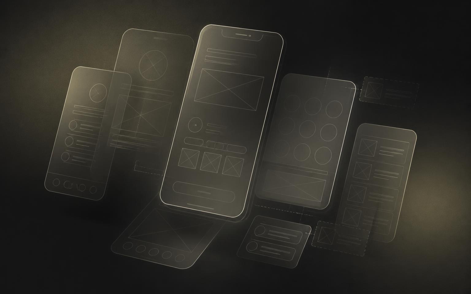
A seed-stage Tokyo fintech needed onboarding that a first-time investor could finish without support. I rebuilt the flow around progressive disclosure, wrote the motion spec for every transition, and shipped an accessible number-entry component now used across the product.
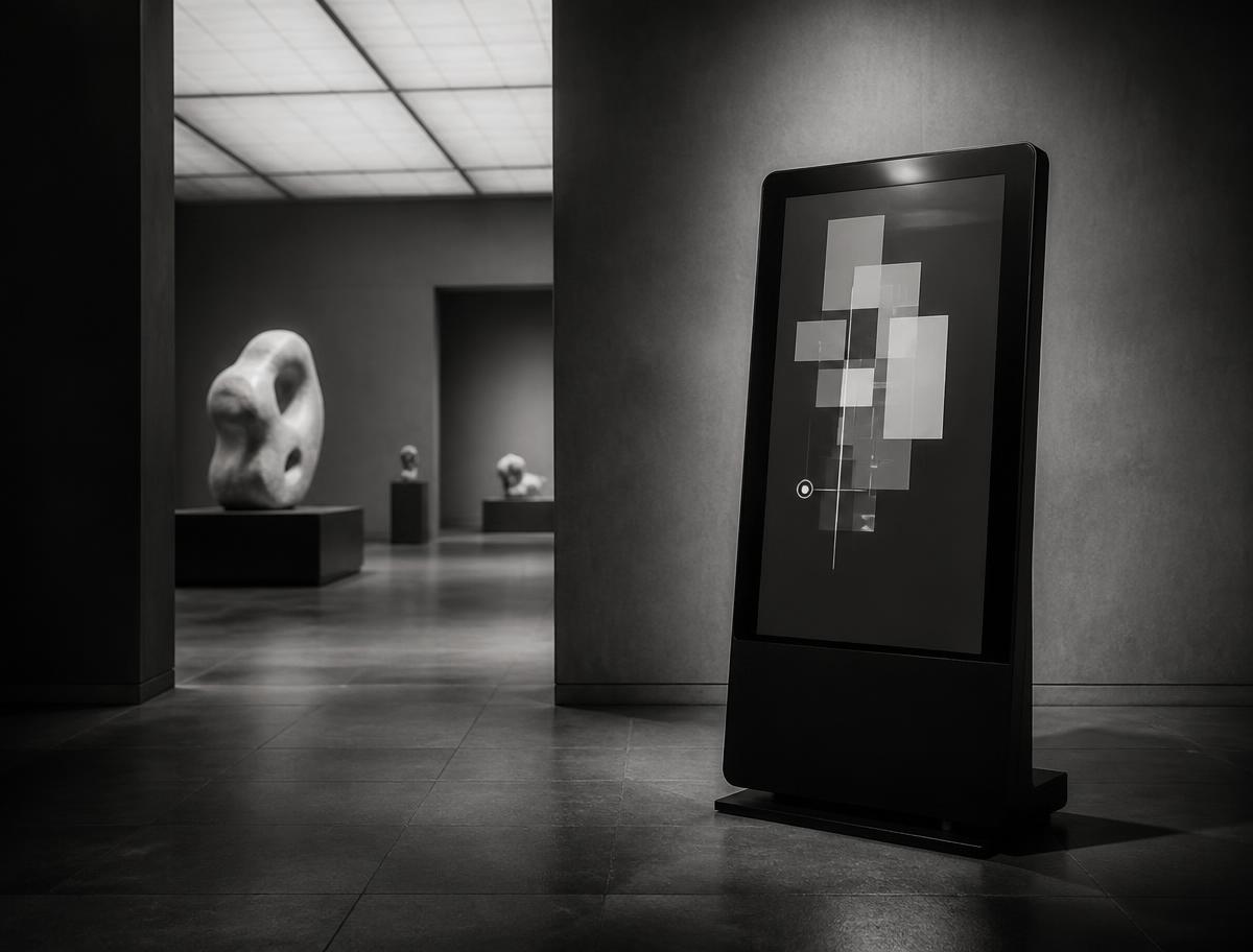
Touchscreen and mobile wayfinding for a contemporary art annex, designed for one-handed use, high ambient light, and visitors reading in three languages.
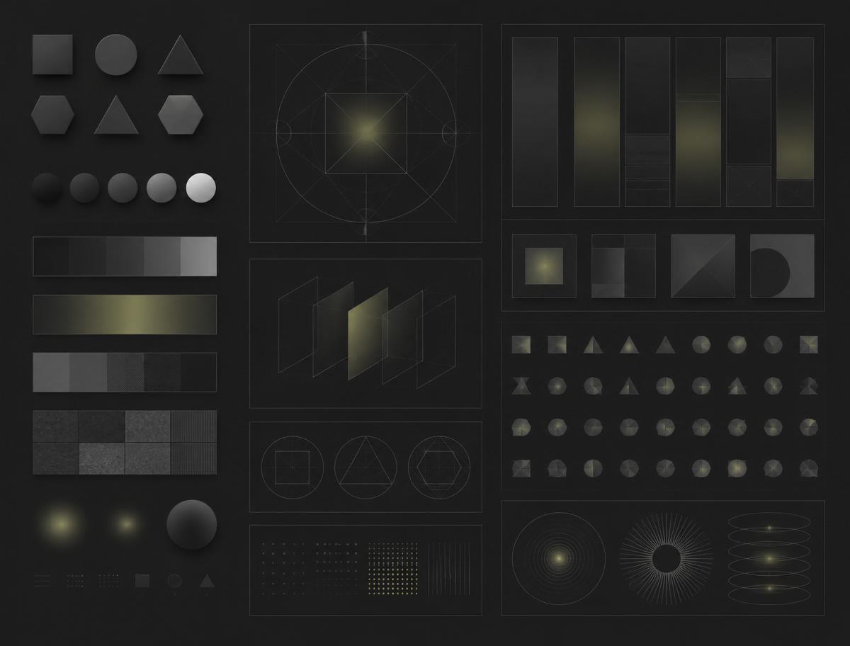
Tokens, components and a documented motion layer where every entrance has a reduced-motion counterpart. Adopted by four teams and released publicly under MIT.
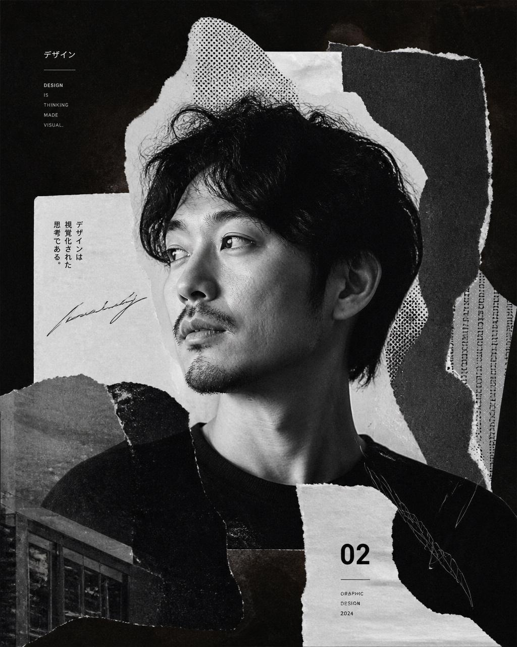
I'm Theo Nakamura, a UI/UX designer and creative technologist. For eleven years I've worked between startups and cultural institutions — two worlds that rarely share a vocabulary but ask the same question: how does this feel to use on the tenth day, not the first?
Motion is not decoration. It is the sentence structure of an interface — it tells you what caused what.
I care about accessibility as craft rather than compliance, about design systems that outlive their authors, and about prototypes built in the real medium. Occasionally I release free Figma resources and write about the parts of design systems nobody documents.
Things I give away: a Figma kit I maintain, and notes from the middle of the work.
138 components with focus, error, empty and reduced-motion states specified. Variable typography scale, warm-neutral tokens, and a written motion appendix.
"Theo spent the first week reading our curators' email threads instead of opening Figma. The wayfinding he shipped is the first digital thing in this building that visitors actually finish using."
Aiko Murakami — Director of Digital, Mori Annex
I take on two engagements at a time. Tell me what you're making and when it needs to exist.